
Mavis Discount Tire Website Redesign
A UI/UX overhaul of Mavis Discount Tire’s commercial website.
Context
An all-design project at the Dartmouth Applied Learning and Innovation (DALI) Lab. We partnered with Mavis Discount Tire to redesign their website.
Timeline
Jan 10 - Mar 6, 2020
Weeks 1-2: Research
Weeks 3-5: Ideate
Weeks 5-9: UI Mockups
Team
Project Manager: Morgan Sorbaro
Designers: Carson Levine, Emma Langfitt, Katrina Yu, and myself
Overview
As one of four designers working part time at the DALI Lab, I conducted competitive and user research, prototyped, and tested mockups of a website for Mavis Discount Tires, a national multi-brand tire retailer.
Challenge
Our challenge was to modernize and simplify an outdated website, with an emphasis on improving user experience and streamlining both the user flow and site architecture.
Outcome
Our team completed a comprehensive design overhaul of all the critical pages from the original site, with positive feedback from user testing. A detailed guide to all the redesigned pages can be found here.

Old website (left) vs redesigned page (right)
Step 1: UX Research
Competitive Research
As unexperienced car owners, my team conducted competitive research to answer the question:
How do we modernize our website to the current industry standards?
We analyzed other tire company websites and made note of all the positive and negative aspects of each one. There was an immense variety in the layout, flow, and overall look of each website. We all favored sites that had straightforward user flows, organized sections, and a clear hierarchy of information.

A Look into Google Analytics
The other designers and I scoured Google Analytics for information that would be useful in redesigning the website. This included demographic information and interaction rates, as well as a breakdown on platform used, times accessed, etc. I found that most users are between the ages of 25 and 65 years old, with 65% male visitors and 35% female. Most visitors are new to the site, with mobile being the platform that is most used.

User Research and Interviews
Through our user interviews, we were able to identify our main user persona as a busy and uninformed middle-aged adult who knows very little about tires and tire selection.

We also created an empathy map and a current state user journey for the main user persona.
Our Main Insights:
Tire Selection
There is a contradiction where the user does not want to extend effort to learn about tires but wants to feel confident that they “got the best deal”
The tire search process is confusing on most tire websites
A low price is a large priority for most customers
Scheduling
User wants to be serviced immediately, especially if they made an appointment
Users want the choice to make an appointment over the phone and online
Current website
Users overlook the tire selection tool
Discounts come across as ads
Most users are not informed about tires and tire selection. However, when buying tires, they prioritize safety, price, and quality and they want to feel that they got the best tire at their stated price point. This all boils down to whether they trust the tire company or not.


According to our research, the redesigned website must be:
Trustworthy
Mavis Discount Tire is a company that is built on trust. Customers want their tires to be dependable and for their chosen tire shop to sell them the best tire for their price point. This trustworthiness must come through in the new website.
User-Friendly
The main demographic we are targeting are soccer moms and other middle-aged adults. Thus, the redesign has to be simple to use and create a frictionless user experience.
Modern
To catch up with competitors and foster a sense of professionalism, the new website has to look clean and modern. However, we also kept in mind that it should not be too modern for fear of isolating the main demographic.
Step 2: Simplifying and Enhancing the User Experience
The current Mavis Discount Tire website is laid out in a way where every section (ie. the “Shop for Tires", “Specials and Rebates”, customer testimonials, and brands sections) are in close proximity with each other at the top of the page. In order to modernize the website and make it more user-friendly, I decided to give every section an individual spot on the home page.
I reformatted the home page into a long-scroll site where each element is given its own space to shine and interact with the user.
The picture on the bottom left is what the current Mavis home page looks like. On the right is my greyscale mockup of the new home page. The order of each section reflects its importance on the home page. The partners stated that the two most important actions they wanted the user to take were to search for tires and to schedule an appointment with a shop close to them. To build trust, I placed the customer testimonials section third so that users could read customer reviews earlier when scrolling through the page.


How can we convey trust through the elements on the home page?

Customer testimonials are one of the most important trust signals a company can use. I ideated and iterated on many versions of the customer testimonials section.
One great aspect of this section from the original website was a real-time reel of all the comments customers left in different stores around New England. This gave it a feeling of candidness, which was important when dealing with customer testimonials and ratings.
Through design critiques in the lab, I got feedback on each iteration and decided on the one at the bottom right.

The reasons against the two on the left were that the main quotes seemed too curated, and worked against the sense of trustworthiness and transparency I was trying to provide. The format on the right is a scrolling feed of all customers’ comments as they are made in real-time, with stars to provide a visual representation of the comments. In the future, the customers’ first names should also be shown in addition to the place to make each comment more personalized.
Simplifying User Flows
Other than the home page, my team and I also worked on subpages such as the tire search, appointment scheduling, and ship to home processes. I was mainly responsible for the pages for the appointment scheduling and ship to home process.
I simplified the user experience of shipping tires home by cutting the process from 6 steps to 3 steps, shown below with the old design on top.


This was made possible by combining the Summary and Payment/Place Order pages, as well as cutting register/login and confirmation out of the timeline entirely.

Step 3: Developing the UI
Our partners from Mavis told us that we could change everything about the website, but two constraints were that we had to keep the mavis colors and the logo. Thus began our major UI design challenge:
How do we make the Mavis turquoise and neon yellow look good on a page?
First, I had to minimize the usage of the neon yellow.
Second, I used a mix of turquoise shades and values to create contrast and hierarchy.
Third, I put in images that matched the color theme to make the page more cohesive.
Most of the elements on this page are designed to using Mavis turquoise color, including section headers, subtext, images, buttons, icons, and the footer. This creates a more cohesive page with sections that complement each other.
In addition to color, I also used the same design elements throughout the page. This includes pill-like buttons, tile formats, full-width images, and the same format of centering text on such images.

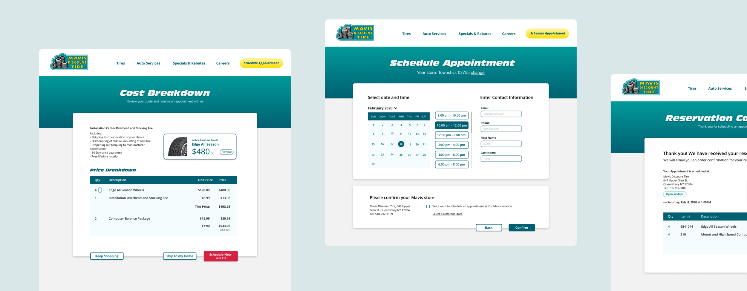
Once I was done with the home page, I had to redesign the Ship to Home and Reserve Appointment pages. However, I was unsure of how to start.
How can we enhance and improve the UI of these information-heavy pages?
I knew I had to completely rethink the interface for these pages. First, I came up with a title for each individual page. I knew that I had used tiles from the home page before, and so a tile format may also work well in this case.
To organize information and enhance user flow, I formatted main sections into tiles.
Then, I incorporated variations of the Mavis turquoise into the design to make it less black and white.
To add a visual element into the otherwise text-heavy page, I added a “tire tile”, a sub-tile with a picture of the tire and its description.
I managed to create a simple style that could be used in a variety of ways, as seen in the slightly-different-but-also-similar set of pages below. The top three screenshots are the original Mavis designs, while the bottom three are my high-fidelity mock-ups of the same pages.

Old pages before redesign
A collection of the redesigned pages
Handoff and Next Steps
Design Handoff
Our DALI team created a handoff document with details about all the redesigned pages, user flows, and the updated design language and style guide. We gave this to Mavis’ software development team, who will implement the changes to their site. I look forward to analyzing the success metrics once the redesigned site is fully deployed.
Future User Testing
Our team was able to conduct limited user testing due to time constraints. However, if given the opportunity, I would like to conduct more in-depth user testing in the future. Most of the pages need detailed user testing, particularly the home page. I am curious as to what elements of the home page decrease the bounce rate and increases user interaction.
Redesign More Pages and Edit Existing Redesigns
There are many more pages on the website that we could recreate. These pages, including the tire brands section, auto service section, and more are all flows that could be redesigned. In addition, I would like to redesign the UI of the home page to be cleaner and even more cohesive.
A selection of the final pages:


